brand development
Punch House
Punch House is a visual concept built for a local restaurant group to celebrate the craft and diligence in serving crowd-pleasing mixed drinks at scale.

The dream for Punch House started in a home-grown test kitchen, between friends, dedicated to the experimentation and excitement of creating drinks for the people you love.
Cultivating an atmosphere, creating a wave length, sharing an experience, all through the art of the mixed drink.
Cultivating an atmosphere, creating a wave length, sharing an experience, all through the art of the mixed drink.
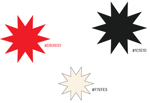
Punches are typically vibrant and joyful, but above all a good punch... packs a punch. This brand identity captures the bold, almost raucous spirit of the punchbowl and brings with it a tongue-in-cheek elegance by way of a paired back, yet recognizable color palette.
Identity Mark


The mark itself is bold, playful, and to the point, with the slightly off kilter skew of the negative space alluding to the slosh of a drink mid-cheers.
Color Palette and Typefaces


The color palette comes from vintage ads for wrestling, a bright and vibrant red to pack a punch against the rich, ink-like black on top of the neutral, cool beige of newsprint.
The type is eccentric and welcoming, with an almost zesty personality that excites and warms the spirit.
